Designed for Everyone: Why Accessibility-First Packaging Is the Beauty Industry's Most Urgent Innovation Frontier
The beauty industry has long prided itself on inclusivity—expanded shade ranges, gender-neutral formulations, campaigns featuring models of every age and background. Yet one dimension of inclusion has remained conspicuously underaddressed: the physical experience of using a beauty product when the packaging itself presents a barrier.
For an estimated 26 percent of American adults living with some form of disability, the elegant twist-off cap, the embossed label printed in 6-point type, and the pump mechanism that requires precise finger coordination are not minor inconveniences. They are daily frustrations that quietly communicate a message no beauty brand intends to send: this product was not designed with you in mind.
That is beginning to change—and the brands leading this shift are finding that designing for accessibility does not narrow their market. It expands it.
The Scope of the Opportunity
Accessibility in packaging encompasses a broader range of considerations than most brand strategists initially appreciate. The most commonly discussed dimension involves consumers with visual impairments, who represent approximately 12 million Americans aged 40 and older with significant vision loss. For these consumers, product identification, usage instructions, and ingredient warnings are effectively inaccessible through conventional printed labels.
But visual impairment is only one entry point into this conversation. Arthritis affects more than 58 million US adults, many of whom struggle with packaging closures that require grip strength, fine motor precision, or sustained rotational force. Neurological conditions including Parkinson's disease and multiple sclerosis create similar challenges. Consumers recovering from hand or wrist injuries—a population that is transient but substantial at any given moment—face identical barriers.
Beyond physical ability, there is the dimension of linguistic accessibility. The United States is home to more than 67 million people who speak a language other than English at home. For these consumers, packaging that communicates exclusively in English—particularly on products with safety-relevant usage instructions—represents a meaningful gap in both brand service and regulatory responsibility.
Texture, Touch, and the Case for Tactile Design
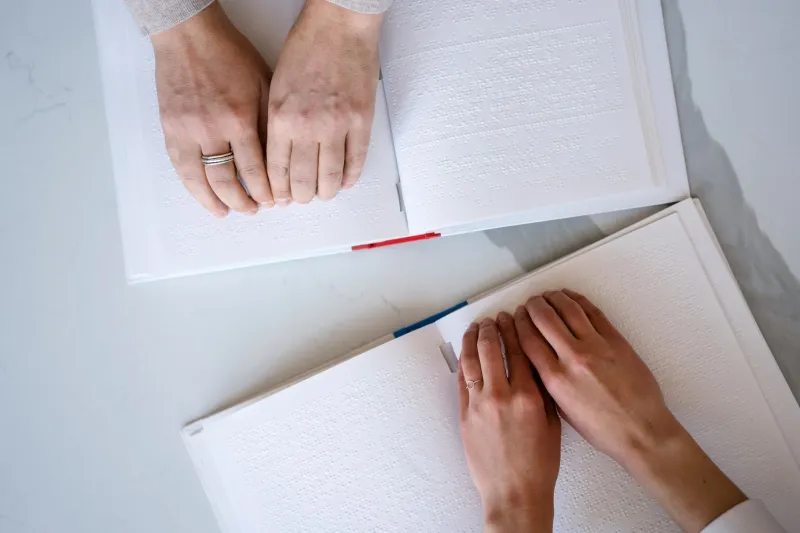
One of the most promising developments in accessible beauty packaging is the growing application of tactile design elements that communicate information through touch rather than sight. Braille integration on cosmetic packaging has existed in limited forms for years, but it has historically been treated as a compliance gesture rather than a genuine design priority—added as an afterthought in a font size too small to be practically useful.
More sophisticated approaches are now emerging. Some packaging designers are developing systems of raised symbols, textured zones, and embossed patterns that allow consumers with visual impairments to distinguish between products within a line, identify the front of a label, or locate the cap release mechanism without assistance. These systems require genuine investment in tooling and structural design, but they create packaging that functions better for every consumer—not only those with impaired vision.
The principle at work here is familiar to architects and product designers: solutions developed for accessibility constraints frequently produce design innovations that improve the experience for all users. The tactile label that helps a visually impaired consumer identify her moisturizer in a dark medicine cabinet also helps a sighted consumer locate the same product at 6 a.m. without her reading glasses.
Ergonomics as a Design Imperative
The ergonomic dimension of accessible packaging is perhaps the most immediately actionable for beauty brands currently evaluating their packaging architecture. Closure systems designed for arthritis-friendly use—lower torque requirements, larger grip surfaces, lever-based mechanisms rather than twist-based ones—represent a category of innovation with broad consumer appeal.
Several US-based packaging suppliers have developed closure systems specifically engineered around reduced grip-force requirements. These systems are not visually distinct from conventional closures; they do not signal disability or compromise aesthetic integrity. What they do is expand the population of consumers who can use the product independently and comfortably.
Pump dispensers, which have become the dominant delivery mechanism in prestige skincare, present their own ergonomic considerations. The standard pump requires downward pressure applied with the palm or finger—a motion that is difficult or painful for consumers with certain joint conditions. Tilted pump heads, side-press dispensers, and foot-operated pump platforms represent design alternatives that packaging engineers are actively developing for the beauty category.
Multilingual Design and the Multicultural American Market
The linguistic dimension of accessible packaging intersects with one of the most significant demographic realities of the contemporary US beauty market: its profound and growing multiculturalism. Spanish is spoken by more than 41 million Americans as a primary language. Mandarin, Tagalog, Vietnamese, Korean, and Arabic each represent communities of millions of consumers with real purchasing power in the beauty category.
Brands that limit their packaging to English-only communication are not simply failing to serve these consumers—they are actively signaling that these consumers were not considered in the design process. In a category as personal and identity-adjacent as beauty, that signal matters.
The response need not be a packaging redesign that accommodates a dozen languages in illegible text. Thoughtful multilingual design might prioritize the two or three languages most prevalent in a brand's core geographic markets, use iconographic communication where language-neutral clarity is achievable, or incorporate QR codes that direct consumers to multilingual digital content for detailed usage instructions and ingredient transparency.
Building Brand Loyalty Through Considered Design
The business case for accessibility-first packaging is, ultimately, a loyalty argument. Consumers who feel genuinely served by a brand's design decisions—who experience a product as having been made for them rather than adapted for them—develop the kind of brand affinity that is difficult to manufacture through conventional marketing.
For beauty brands operating in a market where product differentiation is increasingly difficult to achieve through formulation alone, packaging that signals genuine consideration for diverse consumer needs represents a meaningful point of distinction. It communicates, without a single word of marketing copy, that the brand understands its consumers as complete human beings rather than idealized archetypes.
The brands that will lead this space are not those that treat accessibility as a compliance requirement. They are the ones that recognize it as a design philosophy—and build it into their packaging development process from the very first sketch.