What Your Packaging Says Before You Do: The Psychology of Color and Material in Beauty Purchase Decisions
The Silent Salesperson Standing Between You and the Sale
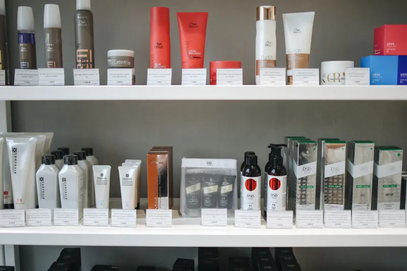
Walk through the beauty aisle of any Sephora, Ulta, or Target in the United States and you will observe something remarkable: most consumers spend fewer than seven seconds evaluating a product before making a decision to pick it up or move on. That window—brief, almost unconscious—is governed almost entirely by packaging. Not the formula inside. Not the brand heritage. The packaging.
For beauty brands competing in one of the most visually saturated retail environments in the world, understanding the psychological machinery behind packaging perception is no longer optional. It is, increasingly, the difference between a product that moves and one that collects dust.
This is the domain where color theory, material science, and consumer neuroscience converge—and where the most strategically minded beauty brands are now investing serious attention.
Color as Emotional Architecture
Color is the first variable a consumer processes, and it operates almost entirely below the threshold of conscious thought. Research in consumer psychology consistently demonstrates that color accounts for up to 90 percent of a snap judgment about a product. For beauty brands, this is both an opportunity and a liability.
Different hues carry deeply encoded associations that vary by demographic, cultural background, and even regional context within the US market. Soft blush pinks and dusty roses continue to signal approachability, femininity, and gentle efficacy—a palette that has anchored everything from prestige skincare to mass-market lip products for decades. Clean whites and pale silvers communicate clinical precision and minimalist luxury, a visual language that resonates strongly with wellness-oriented consumers in urban markets like New York, Los Angeles, and Chicago.
Deep blacks and charcoals, once reserved almost exclusively for men's grooming, have migrated aggressively into premium women's skincare and fragrance packaging over the past several years. They signal authority, sophistication, and potency—qualities increasingly sought by consumers purchasing high-performance actives like retinol, peptide serums, and professional-grade exfoliants.
What is often underestimated, however, is the role of color saturation alongside hue selection. A fully saturated cobalt blue reads as bold and energizing—well-suited to color cosmetics or products targeting younger demographics. That same blue desaturated to a dusty, muted tone shifts the emotional register entirely, evoking calm, trustworthiness, and a certain understated elegance that appeals to a more discerning buyer.
Brands repositioning themselves in the market frequently discover that a shift in saturation alone—without changing the base hue—can meaningfully alter consumer perception without disrupting existing brand recognition.
The Finish Question: Matte, Glossy, and Everything Between
Beyond color, the finish applied to packaging surfaces is among the most consequential decisions a beauty brand's creative team will make. Matte and glossy finishes are not simply aesthetic choices—they are psychological cues that communicate entirely different brand promises.
Glossy finishes reflect light and create visual energy. They are associated with excitement, accessibility, and youthfulness. Glossy packaging tends to perform well in mass-market and drugstore contexts, where visual pop and shelf presence are paramount. It also photographs well, an increasingly important consideration as beauty packaging functions simultaneously as retail merchandise and social media content.
Matte finishes, by contrast, absorb light. They communicate restraint, confidence, and luxury. A matte-finished component feels more expensive in the hand because it does not compete for attention—it assumes it. This is why the shift toward matte packaging among prestige skincare brands over the past decade has been so pronounced. Brands including some of the most recognized names in US department store beauty have migrated from high-gloss to soft-touch matte, and consumer research has repeatedly shown that perceived value increases alongside that transition.
Soft-touch coatings—a hybrid category that delivers a velvety, tactile matte experience—have become particularly prominent among brands targeting the premium-but-accessible segment. The sensory experience of holding a soft-touch component creates an immediate impression of quality that influences willingness to pay, even before a consumer examines the product itself.
Satin and metallic finishes occupy their own psychological territory, evoking aspirational luxury and ceremonial significance. They are most effective when used selectively—as accent elements or limited-edition expressions—rather than as primary packaging languages.
Material Weight and the Perception of Value
The physical weight of packaging is a variable that receives surprisingly little attention in most brand discussions, yet its impact on consumer perception is substantial and well-documented. Heavier packaging—thick glass bottles, weighted caps, substantial cardboard cartons—creates an almost instinctive association with quality and efficacy. This is not a rational response. It is a deeply conditioned one.
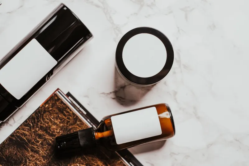
For beauty brands operating in the prestige or masstige segments, material weight functions as a silent validator of price point. A serum packaged in a lightweight plastic dropper and the same serum in a weighted glass bottle with a metal pipette will be perceived very differently by the consumer, regardless of identical formulas. The heavier package communicates that the brand believes in what is inside—and that confidence is contagious.
This dynamic creates a meaningful challenge for brands committed to sustainable packaging, since many eco-friendly materials are lighter than their conventional counterparts. The solution increasingly being adopted by forward-thinking brands is to compensate for reduced material weight through textural interest—embossing, debossing, tactile coatings, and structural complexity that engage the sense of touch and signal intentionality even when the package itself is lighter.
Case Study in Repositioning: When Packaging Redesign Changes Everything
The power of these principles becomes most visible when a beauty brand undergoes a deliberate packaging redesign to shift its market position. A mid-market skincare brand targeting women in their thirties and forties, for example, might find that its existing packaging—bright white with glossy finishes and lightweight plastic components—is inadvertently communicating a mass-market identity that undercuts its premium price point.
A strategic redesign that introduces a cooler off-white palette, transitions to matte or soft-touch finishes, upgrades to heavier glass or weighted resin components, and incorporates subtle embossed typography can, without changing a single formula, meaningfully shift consumer perception of the brand. Retailers may reclassify the product to a more prominent shelf position. Consumers may perceive greater efficacy. Repeat purchase rates may improve simply because the packaging reinforces the premium experience each time the product is used at home.
This is not hypothetical. It is a pattern that has played out repeatedly across the US beauty market, and it underscores a fundamental truth: packaging is not the container for the brand. In many respects, it is the brand, at least in the critical moment of first encounter.
Building a Color and Material Strategy That Converts
For beauty brands looking to apply these principles deliberately, the starting point is a clear-eyed audit of the emotional message their current packaging communicates—not the message they intend to send, but the one consumers actually receive. This often requires qualitative consumer research, shelf testing, and honest engagement with packaging designers who specialize in beauty.
From there, the key decisions—hue, saturation, finish, weight, and texture—should be made in sequence, with each choice evaluated against the specific consumer profile the brand is targeting and the retail environment in which it will compete. A product destined for a boutique specialty retailer requires a different visual strategy than one competing on a mass-market end cap.
The brands that get this right do not leave these decisions to intuition alone. They treat packaging psychology as a discipline—one with real principles, measurable outcomes, and significant competitive consequences.
In a market where the consumer's attention is the scarcest resource of all, the packaging that understands the mind wins the moment.