Quiet Confidence: How Stripped-Back Packaging Design Has Become the New Language of Luxury Beauty
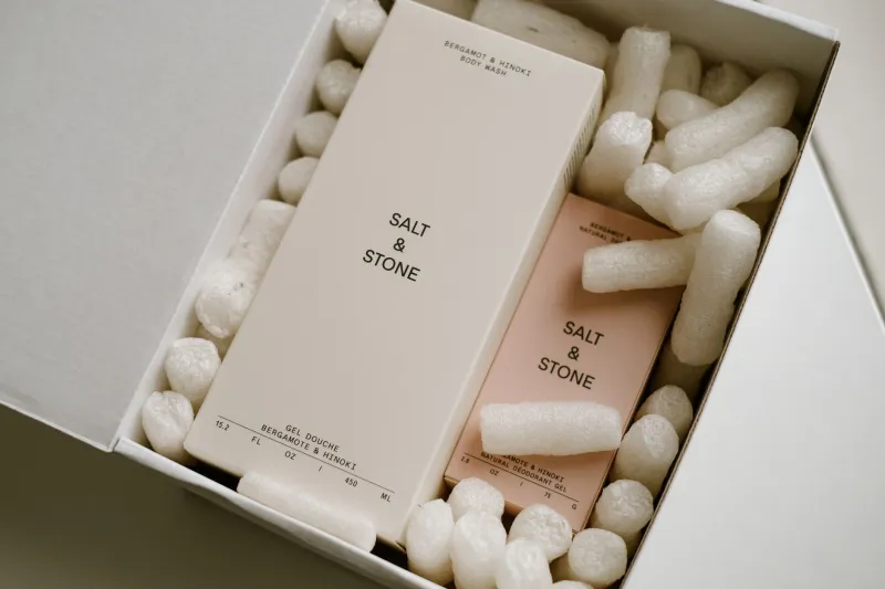
There is a particular kind of confidence that requires no announcement. It arrives in a matte white box, a single embossed logotype, and nothing else. No gilded flourishes. No layered typography. No competing visual elements fighting for the consumer's attention. Just space — deliberate, considered, and extraordinarily expensive to execute well.
This is the minimalist paradox reshaping premium beauty packaging in the United States: the less a brand puts on the surface of its packaging, the more it signals to affluent consumers that it has nothing to prove.
For beauty companies navigating the upper tier of the market, understanding this shift is no longer optional. It is strategic.
The Psychology of Restraint
American consumers have been conditioned by decades of retail abundance to associate visual complexity with value. More ingredients listed, more colors layered, more finishes applied — the implicit message has long been that elaborateness equals effort, and effort equals worth.
But something has shifted, particularly among high-income beauty buyers aged 30 and above. Research into luxury consumer psychology consistently finds that affluent shoppers interpret visual clutter as a signal of insecurity — a brand overcompensating for what it lacks in substance. Simplicity, by contrast, communicates that a brand is so assured of its own quality that it requires no embellishment to make its case.
This is not a new principle in luxury goods broadly. Consider how the most coveted fashion houses have long used stark, unadorned packaging to separate themselves from mass-market competitors. What is new is how aggressively the beauty sector — historically prone to maximalist presentation — is now applying the same logic.
What Minimalism Actually Costs
Here is where the paradox deepens. Packaging that looks effortless is frequently the most technically and financially demanding to produce. Executing true minimalism in beauty packaging requires an exceptional level of material quality, because there is nothing else to direct the eye toward.
When a brand removes decorative elements from a bottle or carton, every imperfection in the substrate becomes visible. The weight of a glass vessel, the precision of a mold seam, the consistency of a matte coating — all of it is exposed. This means that minimalist packaging, done at a level that actually communicates luxury, demands tighter manufacturing tolerances and higher-grade raw materials than most ornate alternatives.
For US beauty brands sourcing packaging through domestic or international suppliers, this translates into a meaningful investment in supplier qualification. A minimalist aesthetic cannot be achieved on a commodity budget. The restraint on the surface must be matched by rigor in the supply chain.
Case Patterns: Brands That Built Premium Equity Through Simplicity
Several patterns have emerged among beauty brands that have successfully leveraged minimalist packaging to command premium price points in the American market.
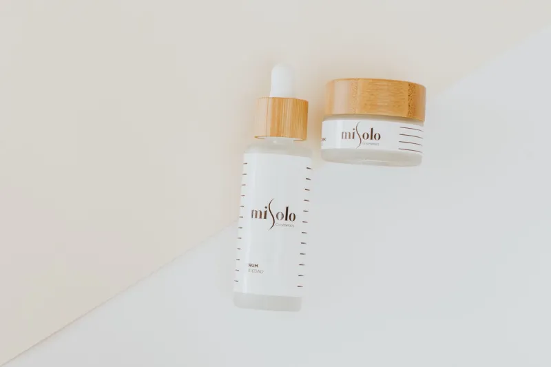
Monochromatic material stories. Brands operating in the prestige skincare space have found particular success in building packaging systems around a single material executed in a single finish — frosted glass throughout, or uncoated paperboard in one consistent weight. The cohesion itself becomes a signal of intentionality. Nothing was added without purpose; therefore, everything present has meaning.
Typography as the sole design element. Some of the most recognized premium beauty packages on US shelves today carry nothing but a typeface — no illustration, no pattern, no secondary graphic element. When typography carries the full weight of brand communication, the choice of letterform, size, and spacing becomes an act of precision that sophisticated consumers register, often without consciously identifying why the package feels authoritative.
Deliberate whitespace as a premium cue. In print design, whitespace is a tool for directing attention. In packaging, it functions as a proxy for scarcity — the suggestion that a brand has not filled every available surface because it does not need to. Brands that allow significant unprinted area on labels and cartons consistently score higher on perceived luxury in consumer testing, even when the underlying formula is held constant.
The Shelf Problem — and Why It Is Not What Brands Think
The most common objection beauty brand teams raise against minimalist packaging is the shelf-presence argument: in a competitive retail environment, won't a restrained package simply disappear?
The evidence suggests this concern is often misapplied. At the mass-market tier, where dozens of SKUs compete for the same consumer in the same price band, visual differentiation through color and graphic complexity is genuinely important. But in prestige retail environments — Sephora's prestige wall, Neiman Marcus beauty counters, curated boutique apothecaries — the dynamic inverts. A minimalist package surrounded by visually busy competitors does not disappear. It reads as the most self-possessed object in the set.
The shelf-presence question, properly framed, is not about volume of visual information but about clarity of visual identity. A stripped-back package that owns its negative space projects more confidence than a dense one that competes with itself.
Navigating the Tension for Mid-Tier Aspirational Brands
For beauty companies positioned between the mass and ultra-luxury tiers — a substantial and growing segment of the US market — the minimalist strategy requires careful calibration. The goal is not simply to remove elements but to remove the right elements while retaining enough legibility and brand personality to connect with consumers who are still building trust in the brand.
Several principles apply here. First, material quality must increase as graphic complexity decreases. A minimalist approach on a low-grade substrate reads as underfunded rather than refined. Second, the minimalist direction should be introduced progressively — beginning with hero SKUs or limited editions before rolling across the full line — allowing consumer response to inform the pace of transition. Third, the interior experience of the package should be considered as carefully as the exterior. A spare outer carton that opens to reveal a thoughtfully designed interior structure reinforces the message that restraint is intentional, not economical.
The Supplier Conversation
For packaging design directors and brand managers at US beauty companies, the minimalist trend has a direct implication for how supplier conversations should be structured. The brief cannot simply specify what to remove. It must specify the quality standards that make removal viable.
This means engaging suppliers early on material selection, surface treatment capabilities, and quality control tolerances. It means requesting samples that isolate the substrate from decorative finishing, so the base material can be evaluated on its own merits. And it means building in adequate lead time — because the most refined minimalist executions are rarely achieved in the first production run.
A Signal Worth Sending
The brands that have mastered minimalist packaging in the beauty space share one underlying conviction: that their consumer is sophisticated enough to read absence as intentionality. They are betting that their target buyer will understand that the whitespace is not emptiness — it is editorial. Every element that was considered and excluded is as much a part of the design as what remains.
In a market where beauty consumers are increasingly skeptical of overclaiming and visual hyperbole, that bet is paying off. The quiet package, it turns out, has a great deal to say.