When Simple Costs More: The Surprising Economics Behind Minimalist Beauty Packaging
There is a persistent assumption in the beauty industry that stripping a package down to its essentials should, by extension, strip cost from the manufacturing process. Fewer embellishments, fewer finishes, fewer printed elements — the math seems straightforward. Yet packaging engineers and brand strategists across the United States are increasingly confronting a counterintuitive reality: the cleaner the design, the more demanding — and expensive — the production requirements tend to be.
This is the minimalist paradox, and for beauty brands navigating today's aesthetic landscape, understanding it is no longer optional.
The Illusion of Simplicity
Ornate packaging has a built-in tolerance for visual complexity. Embossed florals, layered foil stamps, and intricate print patterns create a kind of visual noise that, while intentional, also serves a practical function: it masks minor inconsistencies. A slight variation in registration, a subtle shift in ink density, a faint surface scratch — these imperfections disappear into the decorative texture of a heavily designed package.
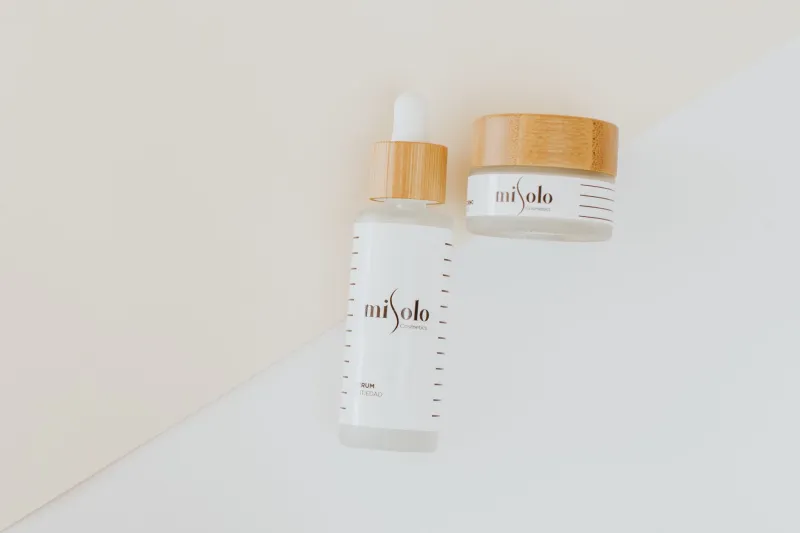
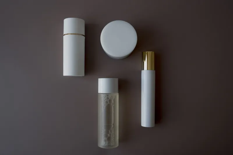
Minimalist packaging offers no such concealment. A single-color matte vessel with debossed typography and a clean shoulder profile presents every surface flaw with unsparing clarity. The margin for error collapses. What was previously a quality control concern becomes a rejection criterion.
Packaging engineers describe this phenomenon in terms of "visible tolerance." On a highly decorated component, the acceptable deviation in surface finish or dimensional accuracy might span several tenths of a millimeter. On a minimalist piece — particularly one with large uninterrupted surface planes — that same deviation becomes immediately perceptible to the human eye. Manufacturers must therefore tighten their production parameters, invest in more precise tooling, and implement more rigorous inspection protocols. Each of these adjustments carries a direct cost implication.
Material Selection Under a Magnifying Glass
The substrate choices that define minimalist beauty packaging further compound the economic challenge. The aesthetic vocabulary of this trend — matte textures, soft-touch coatings, frosted glass, uncoated paperboard, raw aluminum — draws heavily from materials that are either inherently expensive to source or technically difficult to process at scale.
Soft-touch coatings, for example, have become something of a signature finish for premium minimalist beauty brands. The velvety, low-sheen surface communicates restraint and quality simultaneously. However, this coating is sensitive to UV exposure, prone to fingerprint retention, and susceptible to scuffing during fulfillment operations — all of which require downstream handling adjustments and, in many cases, additional protective packaging during transit.
Frosted glass presents its own sourcing complications. Demand from the beauty and spirits industries has tightened supply chains for high-quality frosted borosilicate and soda-lime glass in the US market. Brands sourcing domestically or from preferred suppliers in Western Europe are facing longer lead times and elevated minimums. Those who pivot to lower-cost alternatives often discover that the consistency of the frosted effect — its uniformity across a production run — does not meet the standards that a minimalist design demands.
Uncoated paperboard, favored for its organic, tactile quality, introduces its own set of challenges. Without a protective coating, the substrate is more vulnerable to moisture, more susceptible to scuffing during printing, and less forgiving of ink variation. Print vendors must calibrate their processes carefully to achieve consistent results, which typically means slower run speeds and higher setup costs.
The Typography Problem
For many minimalist beauty packages, typography is the primary — sometimes the only — decorative element. A brand name rendered in a bespoke typeface, debossed into a matte aluminum cap or hot-stamped in a single metallic tone onto a glass vessel, carries the entire visual weight of the design. The execution must be flawless.
Debossing on curved surfaces, in particular, requires tooling precision that exceeds what most standard packaging runs demand. The die must account for the geometry of the substrate, the compression characteristics of the material, and the desired depth of impression — all while maintaining legibility at the specified type size. Custom tooling for a single deboss die on a complex curved surface can represent a meaningful line item in a startup brand's packaging budget, and it must be amortized across a sufficient production volume to make economic sense.
Hot stamping on matte surfaces introduces a different challenge. The adhesion characteristics of stamping foils vary considerably depending on the coating beneath them, and achieving a crisp, clean stamp edge — without halo effects or foil pickup beyond the intended area — requires careful material pairing and press calibration. Brand strategists note that brands frequently underestimate the sampling and development cycles required to achieve the precise result their minimalist design specifies.
What Brand Strategists Are Advising
For brands committed to the minimalist aesthetic, the financial reality demands a shift in how packaging budgets are structured and how supplier relationships are managed.
Engaging packaging manufacturers earlier in the design process is consistently cited as the most effective cost-mitigation strategy. When production engineers can review a design concept before it is finalized, they can identify potential manufacturing complications and suggest material or structural adjustments that preserve the aesthetic intent while reducing technical risk. This collaborative model requires a degree of transparency about design objectives that some creative teams find uncomfortable, but the upstream investment in alignment typically reduces costly revision cycles downstream.
Consolidating SKU counts is another lever that brands are pulling. A tightly edited product range allows a brand to concentrate its volume on fewer packaging components, improving its negotiating position with suppliers and making the economics of precision tooling and premium materials more favorable. For emerging brands in particular, the discipline of launching with a smaller, cohesive range rather than a broad assortment can meaningfully improve the unit economics of a minimalist packaging program.
Finally, strategists are encouraging brands to reframe how they communicate packaging costs internally. The premium associated with minimalist production is not waste — it is the cost of the design's credibility. A soft-touch bottle that arrives at retail with a consistent, flawless surface finish is delivering on the brand promise that the minimalist aesthetic establishes. Treating that premium as a brand investment, rather than a manufacturing inefficiency, aligns the conversation with the strategic value the packaging is designed to create.
The Competitive Calculus
None of this is to suggest that minimalist packaging is an impractical choice for beauty brands. The aesthetic continues to resonate powerfully with US consumers, particularly in the prestige and masstige segments where clean design signals confidence and sophistication. The brands that navigate the cost paradox most successfully are those that enter the process with clear eyes about what they are paying for and why.
Simplicity, in packaging as in most disciplines, is not the absence of effort. It is the result of extraordinary effort made invisible. For beauty brands that understand this, the minimalist paradox becomes less a financial obstacle and more a quality benchmark — a standard that, when met, distinguishes the brands that truly understand their craft from those that merely follow the trend.