The Fine Print, Redesigned: How Beauty Brands Are Turning Required Labeling Into a Storytelling Advantage
Ingredient lists and regulatory disclosures have long been treated as the packaging equivalent of terms and conditions—necessary, ignored, and tucked as far out of sight as possible. A growing number of beauty brands are challenging that assumption, discovering that the required information on their packaging is not a design liability but an underused brand asset. The shift is less about aesthetics than it is about trust.
For decades, the cosmetics industry's approach to mandatory labeling was essentially defensive. Comply with FDA requirements, meet INCI naming conventions, fit the net weight declaration and country of origin into the smallest legible font, and move on. The goal was to satisfy regulators without cluttering the design. The ingredient list was a footnote, not a feature.
That orientation is becoming commercially untenable. American consumers—particularly those under 40—are reading labels with a level of scrutiny that would have seemed unusual a generation ago. They are cross-referencing ingredients against databases like EWG's Skin Deep, sharing formulation breakdowns in online communities, and actively rewarding brands whose packaging communicates ingredient transparency rather than obscures it. In this environment, hiding the ingredient list is no longer neutral. It reads as evasive.
Why Regulatory Information Is a Design Problem Worth Solving
The challenge of integrating required labeling into a cohesive design is genuinely difficult, and dismissing it as a purely aesthetic concern misses the structural complexity involved. INCI names—the standardized international nomenclature used for cosmetic ingredients—are frequently long, Latin-derived, and visually awkward. A complete ingredient declaration for a modern serum can run to several hundred characters. Net weight, lot number, expiration format, manufacturer address, and country of origin add further text demands. Managing all of this within a design system that is also trying to communicate brand identity, product benefits, and shade information is a legitimate creative and spatial challenge.
The brands solving this problem well are not simply choosing a more attractive font for their ingredient list. They are rethinking the spatial hierarchy of the entire package, identifying which information serves which audience, and building design systems that give required labeling a considered role rather than an afterthought placement.
Legibility as a Brand Signal
One of the most consistent findings among brands that have redesigned their labeling approach is that legibility itself functions as a brand signal. When a consumer can read an ingredient list without squinting—when the type is sized for actual human vision rather than regulatory minimum—it communicates something about the brand's relationship with its customer. It suggests the brand expects consumers to read the label and welcomes that scrutiny.
This is a meaningful differentiation in a market segment where ingredient anxiety is high. Consumers who are actively avoiding parabens, sulfates, or synthetic fragrance are not reassured by a technically compliant label printed in six-point type on a curved surface. They are reassured by packaging that treats the ingredient declaration as information worth communicating clearly.
Several indie beauty brands have taken this further by adding brief, plain-language annotations alongside INCI names—a parenthetical that identifies "Niacinamide" as a pore-minimizing agent or notes that a preservative system is "broad-spectrum, fragrance-free." This approach requires careful regulatory review to ensure that benefit claims remain compliant, but when executed correctly, it transforms the ingredient list from an obligation into a guided tour of the formula.
Typography and Layout as Design Tools
Beyond legibility, the typographic treatment of required information can actively contribute to brand identity rather than diluting it. Brands with a strong editorial aesthetic have begun applying the same typographic rigor to their ingredient declarations that they apply to their product names—selecting typefaces that carry the brand's visual personality, using weight variation to create hierarchy within a dense text block, and spacing copy in ways that make dense information feel considered rather than compressed.
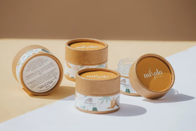
Layout strategy also opens up possibilities that many brands have not fully explored. The back panel of a carton, historically treated as a compliance dump, can be organized as a genuine information design exercise. Grid-based layouts that separate benefit claims, ingredient declarations, usage instructions, and legal disclosures into clearly delineated zones make the same regulatory content feel intentional rather than chaotic. Some brands have introduced iconographic systems—simple symbols indicating key ingredient categories, certifications, or formula attributes—that allow consumers to scan for the information most relevant to them without reading every word.
Making Sustainability Claims Work Harder
For brands with genuine sustainability credentials, the packaging's information layer presents a particular opportunity. Third-party certifications—USDA Organic, Leaping Bunny, Ecocert, B Corp—are regulatory and marketing assets simultaneously. How they are displayed matters. A certification mark buried in the lower corner of a back panel next to the lot number communicates something very different from one that has been given a considered position within the design hierarchy.
The same principle applies to ingredient sourcing claims. A brand that sources a hero ingredient from a specific region, uses a patented delivery system, or has achieved a particular purity standard has information that is simultaneously required or verifiable and commercially valuable. Packaging that treats this information as disclosure rather than story is leaving a brand-building opportunity unused.
The Compliance-Creativity Balance
It would be irresponsible to discuss ingredient labeling as a design asset without acknowledging the compliance complexity involved. FDA regulations governing cosmetic labeling are specific, and the consequences of non-compliance—from import alerts to consumer enforcement actions—are serious. The move toward more expressive or annotated labeling requires close coordination between design teams and regulatory counsel, and brands expanding into international markets face additional complexity as labeling requirements vary significantly by country.
The most effective approach is to bring regulatory review into the design process early rather than treating it as a final checkpoint. When compliance requirements are understood as design parameters from the outset—constraints that shape the creative solution rather than revisions that limit it—the resulting packaging tends to be both legally sound and visually coherent.
Information as Identity
The beauty brands that have made the most progress in this space share a foundational belief: that what a product is made of is as important to communicate as what it does. When that belief is reflected in how required information is presented—with the same care and intentionality applied to the brand name or the product photography—the packaging stops functioning as a regulatory document and starts functioning as a brand statement.
In a market where consumers are increasingly sophisticated about formulation and increasingly skeptical of vague benefit claims, that shift in orientation is not merely aesthetic. It is strategic.